All great brands start with a great logo – but what exactly makes a great logo?
Graphic designers agree that the most effective logos are the ones which are distinctive and memorable, and convey a message about the brand they represent. However, even the most iconic logos are refreshed to keep up with the changing times.
The graphic design space is ever-evolving, which is one of things the Ideabar creative team loves most about the industry! With our eyes peeled and fingers on the pulse, we’re constantly forecasting what’s next to help our clients stay relevant and ahead of the curve.
Here are some of 2021’s top logo design trends with examples from our recent work:
Perspective Depth
Plenty of brands have embraced a more minimalistic design approach over the past few years – but some would argue this has led to logo over-simplification. To combat this issue, we’re predicting a rise in the use of perspective depth to create engaging visuals that will stand out against an influx of flat logomarks. By leveraging techniques like linear perspective and foreshortening, designers can create an interesting illusion without complicating the final product.
Simplistic Geometry
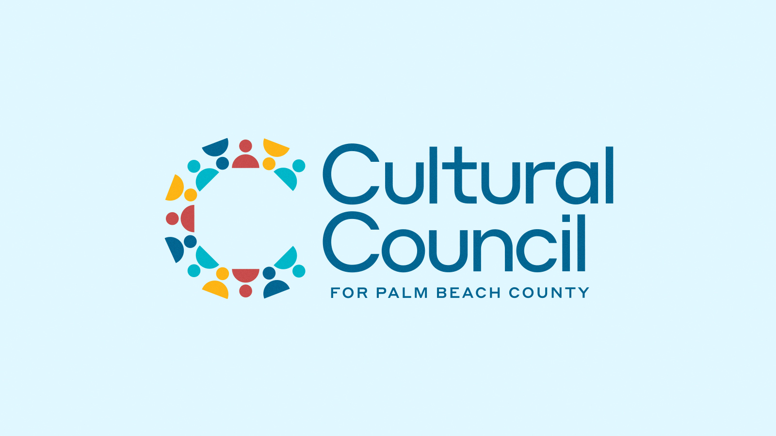
Don’t underestimate the pure power of primitive shapes. Studies show that by 18 months, most toddlers can identify the majority of basic shapes like circles, squares and triangles. They’re the building blocks of design, and when used prominently in a logo, they have the power to create a symbolic and impactful statement. Their inherent simplicity also allows for other risks to be taken, such as bold color combinations or unexpected fonts.
Statement Lettering
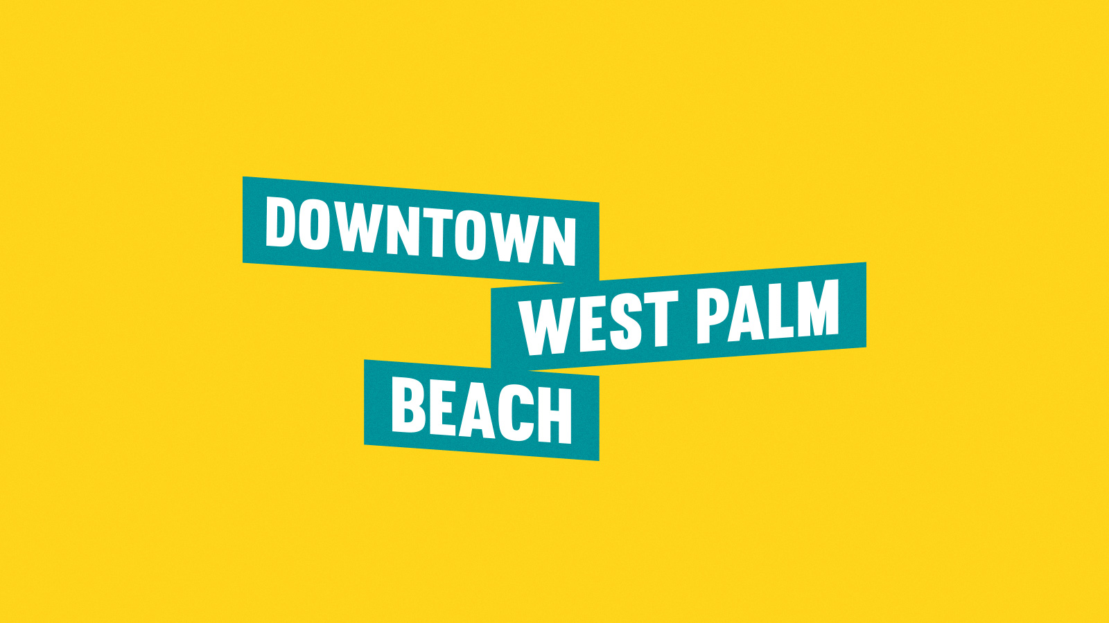
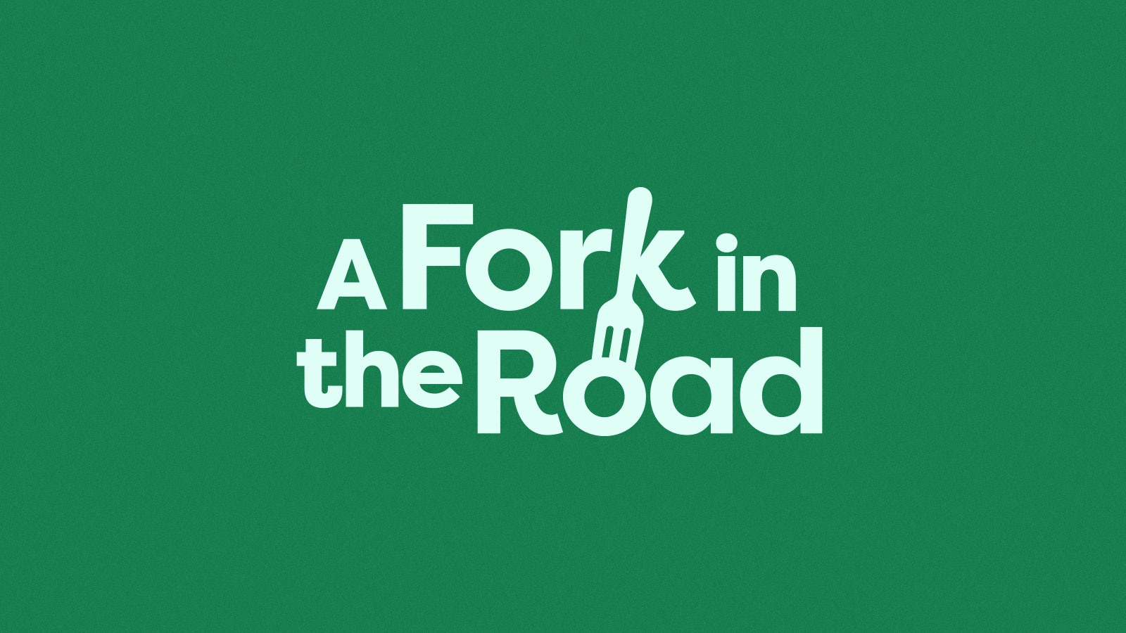
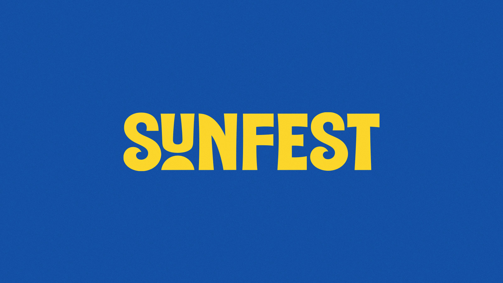
Logos based entirely on a typeface are known as wordmarks and tend to get mixed reviews. While some of the world’s most famous brands use wordmarks (think: Coca-Cola), they can leave little room for creative exploration. That’s why we’re expecting to see more brands embrace statement lettering in 2021 by emphasizing one specific character in the wordmark. This can be achieved simply by altering a letter’s size, font or color – or through more complex tactics, like reimagining one letter into a symbol that speaks to the brand’s purpose.
Original Typography
Speaking of wordmarks, text-based logos can leverage creative typography to instantly give consumers a glimpse of their unique brand personality. To truly stand out from the crowd, we expect to see more brands requesting customized, original typography that can’t be found anywhere else (we’re looking at you, Helvetica). As long as the wordmark remains legible, your brand will be good to go.
Fine Lines
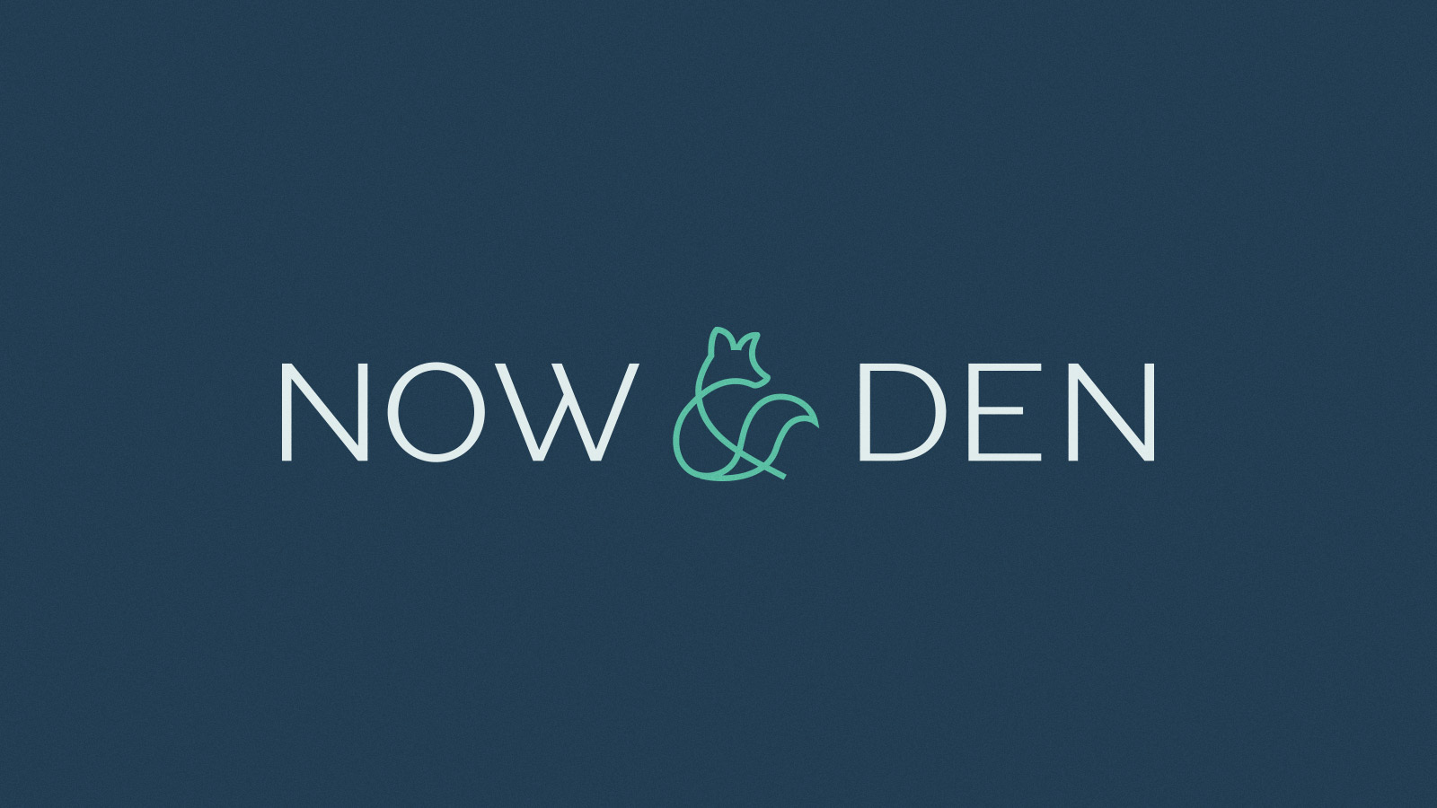
While bold lettering and heavy designs can definitely make a statement, we’re predicting that logos made from fine lines will become increasingly popular in the years to come. These logos are crisp, clean and have a modern-yet-timeless appeal. These elegant logos have an ethereal feel and will most likely be seen paired with sans serif fonts and simple color treatments.
Plus, they’re easy to scale and look sharp across a range of canvases, from websites and print ads to videos, billboards, merchandise and more.
Whether your company needs a new logo or a strategic update to your existing collateral, our branding and creative teams are here to help! Contact us today to get the conversation started.
